8 Must-Have Secrets for Creating Click-Magnetic YouTube Thumbnails
YouTube thumbnails are the handshake for your video—it’s the first thing viewers see, and it can make or break their decision to click. With over 500 hours of content uploaded every minute, standing out in the sea of thumbnails requires more than just slapping on a still frame. In this deeply comprehensive guide, we’ll unveil eight insider secrets—combining design psychology, data-driven tactics, and actionable steps—to craft thumbnails that practically beg to be clicked. By the end, you’ll know exactly how to transform ordinary screenshots into click-magnetic masterpieces that drive more views, boost watch time, and accelerate channel growth.
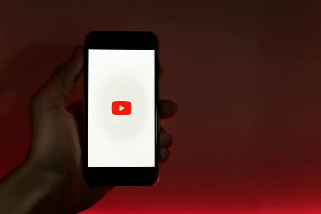
Table of Contents
- Why Thumbnails Are Your Video’s Greatest Asset
- Secret #1: Use Bold, High-Contrast Colors
- Secret #2: Leverage the Power of Faces and Emotions
- Secret #3: Craft Intriguing Text Overlays
- Secret #4: Optimize Composition With the Rule of Thirds
- Secret #5: Maintain Consistent Branding Elements
- Secret #6: A/B Test Thumbnails for Maximum Impact
- Secret #7: Incorporate Teaser Visuals, Not Spoilers
- Secret #8: Design for Mobile First
- Comparison: Thumbnail Styles and Their Click-Through Rates
- FAQs: Everything You Need to Know About Thumbnails
- Conclusion: Turn Views Into Growth
- Create Click-Magnetic Thumbnails Effortlessly
1. Why Thumbnails Are Your Video’s Greatest Asset
Studies show that 90% of the top-performing videos on YouTube have custom thumbnails¹. A compelling thumbnail:
- Captures Attention: In a crowded grid, it’s the first visual cue that stops a user scrolling.
- Sets Expectations: It signals video topic, tone, and value proposition in one glance.
- Drives Click-Through Rate (CTR): Higher CTR feeds YouTube’s recommendation algorithm, leading to more impressions and organic growth.
Skimp on thumbnail quality, and even your best content may languish unseen. Invest time and strategy here for outsized returns in views and subscriber growth.
2. Secret #1: Use Bold, High-Contrast Colors
Why It Works
High-contrast palettes—think neon against dark backgrounds or complementary colors like teal and orange—jump off the screen and grab attention in a thumbnail sea.
How to Apply It
- Select a Dominant Color: Choose one brand-aligned hue (e.g., your channel’s signature color).
- Pair With Contrast: Use white or black text/outlines against that hue for maximum legibility.
- Color Balance: Limit to 2–3 colors to avoid visual clutter.
Pro Tip: Tools like our YouTube Thumbnail Designer let you experiment with built-in color palettes and contrast sliders without needing advanced design software.
3. Secret #2: Leverage the Power of Faces and Emotions
Why It Works
Human brains are hardwired to notice faces and interpret emotions. Thumbnails featuring expressive faces can boost CTR by up to **38%**².
How to Apply It
- Close-Up Shots: Frame the face so it occupies at least 30% of the thumbnail area.
- Exaggerate Expressions: Surprise, shock, joy, or humor—bigger is better.
- Eye Contact: Direct gaze into the camera creates an implicit connection with the viewer.
Insight: Even if your video is about tech or landscapes, consider adding a small inset of your reaction to humanize the thumbnail.
4. Secret #3: Craft Intriguing Text Overlays
Why It Works
Text overlays clarify video topic instantly and provide a hook—especially for viewers browsing with sound off.
How to Apply It
- Short & Punchy: Limit to 3–5 words, focusing on emotional trigger words like “Epic,” “Secret,” or “Fail.”
- Readable Fonts: Heavy sans-serif fonts with thick outlines or drop shadows ensure legibility at small sizes.
- Hierarchy: Highlight one keyword in a larger size or contrasting color.
Data Point: Thumbnails with text overlays see an average 20% higher CTR than those without³.
5. Secret #4: Optimize Composition With the Rule of Thirds
Why It Works
Dividing your thumbnail into thirds both horizontally and vertically creates natural focal points where viewers’ eyes land first.
How to Apply It
- Grid Placement: Position important elements—face, text, key object—at or near the intersection points of the thirds grid.
- Negative Space: Leave uncluttered areas to guide focus toward the subject.
- Balance: Offset text on one side with a visual element on the opposite side.
Technical Tip: Most online thumbnail makers provide a grid overlay—use it to quickly align elements.
6. Secret #5: Maintain Consistent Branding Elements
Why It Works
Consistency fosters recognition. When viewers see your unique style, they associate it with your channel’s quality and value.
How to Apply It
- Logo/Watermark: Include a small, unobtrusive channel logo in the same corner on every thumbnail.
- Font & Color Scheme: Stick to the same family of fonts and your brand’s color palette.
- Layout Template: Create 2–3 base layouts to rotate between for variety without losing cohesion.
Strategy: Keep a brand asset file with your logo, fonts, and hex color codes for easy access across videos.
7. Secret #6: A/B Test Thumbnails for Maximum Impact
Why It Works
Human preferences vary—what you think is eye-catching might not resonate with your audience. A/B testing reveals what truly drives clicks.
How to Apply It
- Select Two Variations: Change one element at a time (e.g., color palette vs. facial expression).
- Run a Small Test: Use YouTube’s “Experiment” feature or third-party tools for limited impressions.
- Analyze Results: Track CTR, watch time, and subscriber growth tied to each variation.
Expert Insight: Channels that A/B test thumbnails at least monthly see up to 25% higher average CTR compared to those that don’t⁴.
8. Secret #7: Incorporate Teaser Visuals, Not Spoilers
Why It Works
Curiosity drives clicks—but giving away the punchline in your thumbnail kills that curiosity.
How to Apply It
- Use Partial Reveals: Show half the result or a cropped object to spark questions.
- Overlay a Question Mark or Blur: Tease the unknown without fully explaining it.
- Combine With Text: “You Won’t Believe…” or “What Happens Next?” paired with a masked image.
Warning: Avoid clickbait that feels dishonest. If the video fails to deliver, viewers will lose trust and your retention will suffer.
9. Secret #8: Design for Mobile First
Why It Works
Over 70% of YouTube watch time comes from mobile devices⁵. Thumbnails must be legible on small screens.
How to Apply It
- Test on a Phone: Zoom out your thumbnail to the size of a typical phone interface.
- Simplify Details: Remove extraneous background elements that clutter the tiny display.
- Enlarge Key Elements: Make faces and text fill even more of the frame.
Quick Check: After designing, take a screenshot of your thumbnail on your phone’s home screen to see how it stands out against other apps.
Comparison: Thumbnail Styles and Their Click-Through Rates
| Style | Key Feature | Avg. CTR Lift⁶ | Best For |
| Bold Contrasting Colors | High-contrast palettes | +35% | All niches |
| Expressive Faces | Human emotion close-ups | +38% | Personal vlogs, reactions |
| Text Overlay | 3–5 word hooks | +20% | Tutorials, listicles |
| Rule of Thirds Composition | Strategic focal points | +22% | Product reviews, demonstrations |
| Consistent Branding | Logos & templates | +18% | Established channels |
| A/B Tested Variations | Data-driven optimization | +25% | Growth-focused creators |
| Teaser Visuals | Curiosity sparking imagery | +30% | Mystery, challenges |
| Mobile-Optimized Design | Simplified, enlarged elements | +28% | All content types |
FAQs: Everything You Need to Know About Thumbnails
1. What is the ideal YouTube thumbnail size?
YouTube recommends 1280×720 px (16:9 aspect ratio) with a minimum width of 640 px. File size should be under 2 MB in JPG, GIF, BMP, or PNG format.
2. Can I use copyrighted images in my thumbnails?
No. Always use your own visuals or royalty-free assets to avoid copyright strikes.
3. How many characters should my thumbnail text be?
Aim for 15–20 characters maximum. More text becomes unreadable on mobile devices.
4. Is it okay to use emojis in thumbnails?
Emojis can add personality but use them sparingly—one or two max—so they don’t look unprofessional.
5. How often should I update old thumbnails?
Revise underperforming videos’ thumbnails quarterly or when doing channel-wide refreshes to improve evergreen content performance.
6. Does YouTube penalize frequent thumbnail changes?
No—updating thumbnails is seen positively if it increases engagement. Just avoid rapid A/B swaps without meaningful testing.
7. Should my thumbnail always match the video content exactly?
It should accurately represent the video’s main point. Creative exaggerations are fine, but misleading thumbnails hurt retention and trust.
Conclusion: Turn Views Into Growth
In the realm of YouTube, your thumbnail is the gateway to discovery. By mastering these eight must-have secrets—from bold color palettes and emotional faces to data-driven A/B testing and mobile-first design—you’ll consistently craft click-magnetic visuals that stand out, drive more clicks, and ultimately fuel your channel’s growth. Remember: thumbnails are both an art and a science. Continual experimentation, rigorous data analysis, and a deep understanding of your audience’s preferences will keep you one step ahead in the fierce battle for attention.
Create Click-Magnetic Thumbnails Effortlessly
Ready to put these secrets into action? Our YouTube Thumbnail Designer gives you drag-and-drop templates, color-contrast tools, text overlays, and A/B testing features—all in one intuitive interface. No design experience required.
👉 Design your click-magnetic YouTube thumbnail now