8 Contrast Adjustment Hacks for More Dramatic Images
Want to make your images pop? The secret lies in mastering contrast adjustment. While beginners often rely on auto-enhance buttons, true visual drama comes from intentional contrast control. High contrast can create powerful silhouettes and mood; low contrast can evoke softness or vintage appeal. Whether you’re a photographer, designer, or content creator, learning how to tweak contrast with purpose will instantly elevate your visual storytelling. In this guide, we’ll reveal 8 contrast adjustment hacks that make your images not only stand out but resonate emotionally.
1. Master the Midtones for Balanced Depth
Most people adjust highlights and shadows, forgetting that midtones carry the bulk of visual information. Using tools like curves or levels, fine-tune the midtone area to add richness without blowing out highlights or crushing shadows. This adds subtle drama while preserving skin tones and texture.
Tip: In Photoshop or Pixfav’s Adjust Contrast Tool, try pulling the midpoint slider slightly to the left for a warmer, richer look.
2. Selective Contrast Using Masks
Apply contrast only where it matters. Use layer masks to limit contrast adjustments to specific areas like a subject’s face, background, or foreground. This lets you draw attention to the focal point without flattening or over-processing the rest of the image.
Designer Insight: Combine selective contrast with light vignetting to keep eyes on your subject.
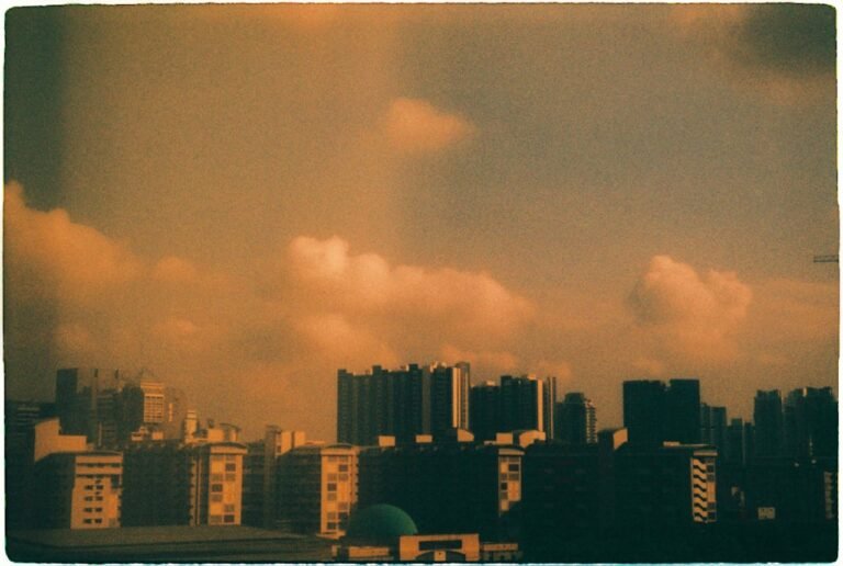
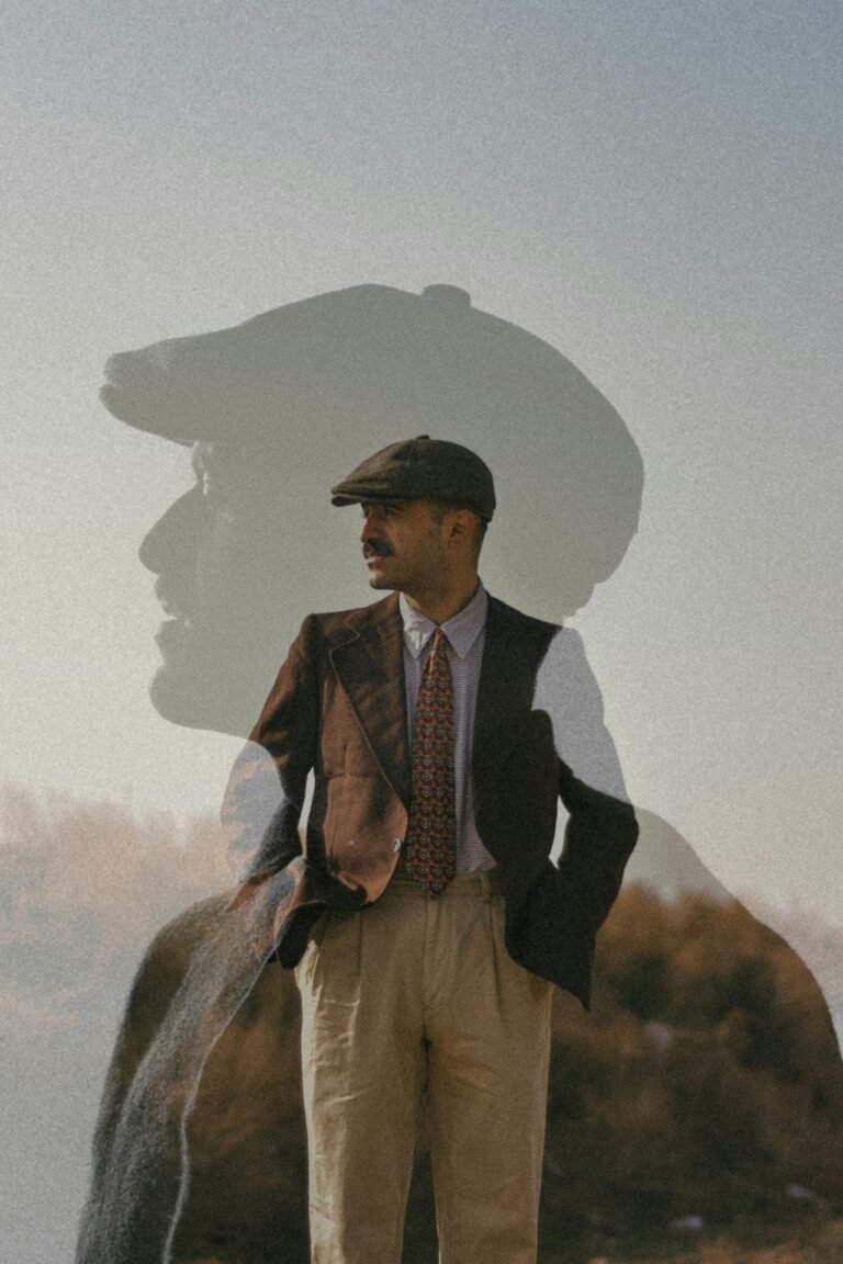
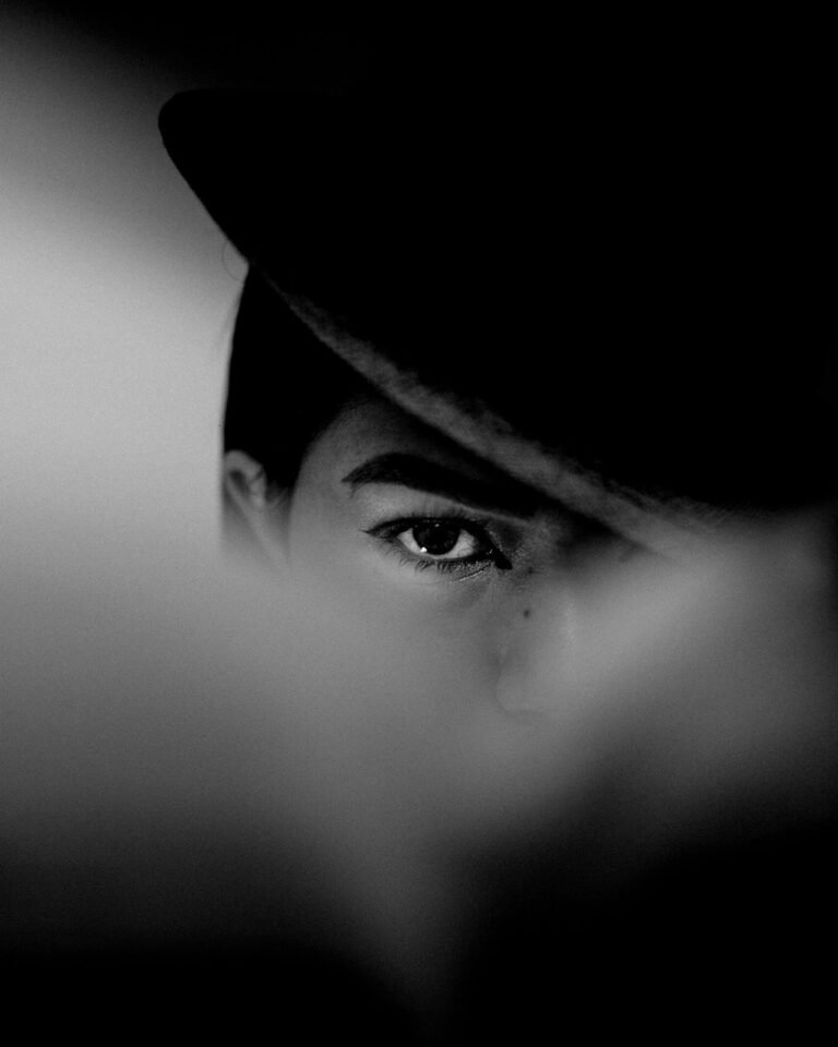
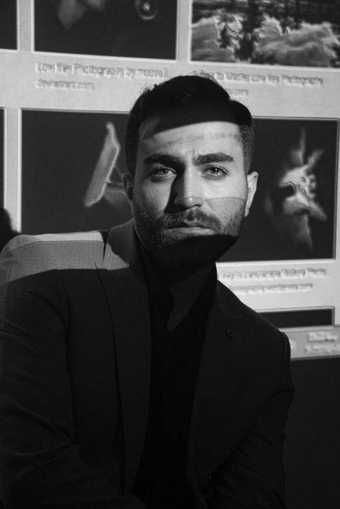
3. Contrast Clipping for High-Impact B&W
Converting to black and white removes the distraction of color, making contrast king. Use contrast clipping to exaggerate darks and lights for high-impact, punchy B&W images. Be careful not to lose detail in important areas.
Hack: Use the histogram to ensure your darks and lights touch the ends but don’t spike too high.
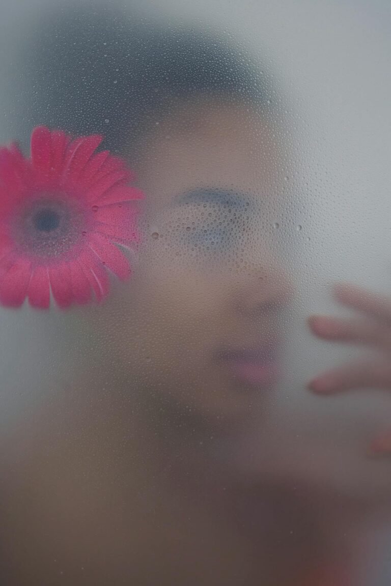
4. Use Contrast to Create Mood
Want drama? Boost contrast. Want a dreamy feel? Lower it. Contrast affects emotional tone. High contrast adds urgency, boldness, and tension. Low contrast softens everything and can feel romantic or retro.
Mood Board Trick: Match your contrast levels with the emotion of your brand or project.
5. Blend Contrast with Color Grading
Contrast and color go hand-in-hand. Use contrast adjustments alongside color grading tools like HSL, LUTs, or split toning. Cooler tones with high contrast often feel cinematic, while warm tones with low contrast feel nostalgic.
Pro Workflow: Adjust contrast first, then color grade for consistency.
6. Use Smart Filters for Non-Destructive Editing
If you’re using Photoshop or a similar tool, convert layers into Smart Objects before adjusting contrast. This way, you can go back and tweak settings anytime without degrading image quality.
Why It Works: Keeps your edits flexible and reversible for client work or design iterations.
7. Leverage Contrast Curves Over Sliders
Sliders are great for quick edits, but curves give you finer control. Create an S-curve to boost highlights and deepen shadows, or flatten the curve for a muted filmic look. This approach adds complexity to the image without making it look fake.
Designer Favorite: The tone curve is your best friend for sophisticated contrast work.
8. Stack Contrast with Sharpening for Crisp Results
After adjusting contrast, apply light sharpening to enhance edges and detail. The combination of high contrast and slight sharpening creates striking, magazine-quality visuals that feel tactile and real.
Tool Combo: Use Pixfav’s Contrast Adjustment Tool followed by a sharpening filter to get that editorial finish.
Comparison Table: Contrast Adjustment Techniques
| Technique | Purpose | Best For |
|---|---|---|
| Midtone Adjustment | Balanced tone and depth | Portraits, Lifestyle shots |
| Selective Contrast with Masks | Focus on subject without over-processing | Product photos, Editorials |
| Contrast Clipping for B&W | Dramatic high-impact visuals | Fine art, Street photography |
| Mood Control via Contrast | Emotional storytelling | Branding, Instagram visuals |
| Blended with Color Grading | Cohesive, stylized edits | Fashion, Commercials |
| Smart Filter Editing | Non-destructive workflow | Client work, Revisions |
| Tone Curves | Advanced tonal control | Designers, Creatives |
| Contrast + Sharpening Combo | Magazine-style crispness | Posters, Print materials |
FAQs About Contrast Adjustment
1. What is contrast adjustment in photo editing?
Contrast adjustment increases the difference between light and dark areas in an image, making details more pronounced and impactful.
2. How does contrast affect image quality?
Proper contrast enhances clarity and mood. Overdone contrast can crush details or make the image look artificial.
3. Should I adjust contrast before or after color grading?
Ideally, contrast should be adjusted first. It lays the tonal foundation for consistent color grading.
4. Can I apply different contrast levels to different parts of a photo?
Yes, using masks or adjustment layers, you can selectively control contrast across various image zones.
5. Are there mobile tools for adjusting contrast professionally?
Yes! Pixfav’s mobile-friendly Contrast Adjustment Tool lets you tweak contrast like a pro from any device.
6. Is high contrast always better?
Not necessarily. It depends on the image’s purpose. High contrast suits dramatic scenes; low contrast suits vintage, soft, or moody photos.
7. What format should I save my edited image in?
Use WebP for web, JPEG for social media, and PNG or TIFF for print to maintain contrast fidelity.
Conclusion
Mastering contrast isn’t just about sliding a bar left or right—it’s about storytelling. Whether you’re going for dramatic, cinematic vibes or subtle, nostalgic tones, the right contrast technique can transform a flat image into a piece of visual art. From precision curve adjustments to emotion-driven edits, the hacks above will help you create sharper, deeper, and more captivating imagery.
Try This Tool: Pixfav’s Contrast Adjustment Tool
Ready to boost your image drama? Use the Contrast Adjustment Tool on Pixfav to fine-tune shadows, highlights, and midtones effortlessly. Whether you’re on desktop or mobile, this free tool gives you full control over contrast levels for breathtaking results.