
7 Creative Pro Collage Layouts to Elevate Your Brand Aesthetic
In a world saturated with visual content, standing out requires more than just beautiful photos—it demands strategic design that tells your brand’s story at a glance. Pro collages offer an ideal way to showcase multiple images, reinforce your brand identity, and engage viewers with dynamic layouts. In this comprehensive guide, you’ll discover seven cutting-edge collage layouts, complete with practical tips, design principles, and technical insights to help you craft scroll-stopping visuals. Whether you’re a marketer, small-business owner, or creative professional, these expert strategies will elevate your brand aesthetic and drive engagement across social platforms.
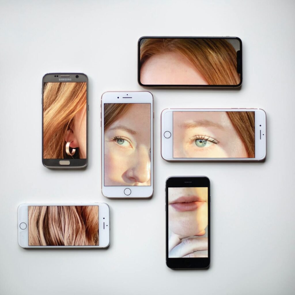
Table of Contents
- Why Pro Collages Power Your Brand
- Layout 1: The Grid Masterpiece
- Layout 2: The Asymmetrical Stunner
- Layout 3: The Layered Overlap
- Layout 4: The Thematic Mosaic
- Layout 5: The Polaroid Carousel
- Layout 6: The Minimalist Split
- Layout 7: The Dynamic Diagonal
- Comparison of Pro Collage Layouts
- FAQs About Designing Pro Collages
- Conclusion: Transform Your Visual Storytelling
- Create Your Next Pro Collage
Why Pro Collages Power Your Brand
Collage Layouts: A well-crafted collage can communicate a narrative faster than a single image. By blending multiple photos, graphics, and text elements into one cohesive design, you can:
- Showcase Variety: Highlight different products, services, or portfolio pieces in one frame.
- Reinforce Identity: Consistent color palettes, fonts, and brand elements tie your visual story together.
- Drive Engagement: Dynamic layouts encourage viewers to pause, explore, and share your content.
Beyond aesthetics, brands using collage-based social posts have seen up to 40% higher engagement compared to single-image posts—thanks to the eye-tracking advantages of multiple focal points.
Layout 1: The Grid Masterpiece
What It Is: A classic grid divides your canvas into equal squares or rectangles, each housing an image or graphic.
Why It Works:
- Symmetry & Balance: The uniform structure creates order and clarity.
- Versatility: Grids adapt to Instagram feeds, website headers, and email banners.
Design Tips:
- Maintain Consistent Spacing: Use equal gutters (e.g., 10–20 px) to separate images.
- Alternate Content: Mix product shots with lifestyle imagery to keep viewers engaged.
- Color Coordination: Apply a unifying filter or hue across all grid cells for brand consistency.
Layout 2: The Asymmetrical Stunner
What It Is: An intentionally unbalanced arrangement where images of varying sizes overlap or offset one another.
Why It Works:
- Visual Tension: Asymmetry creates movement and draws the eye along a path.
- Modern Appeal: Feels fresh and unconventional—perfect for trend-driven brands.
Design Tips:
- Anchor Points: Include one large hero image to ground the composition.
- Offset Balance: Counter a large image with two or more smaller ones on the opposite side.
- Whitespace Is Key: Let empty space breathe around clustered elements.
Layout 3: The Layered Overlap
What It Is: Multiple images and graphic elements stacked with deliberate overlaps and transparent layers.
Why It Works:
- Depth & Dimension: Layers create a 3D feel, inviting viewers to explore beneath the surface.
- Storytelling: Use layering to progress a visual narrative—from background context to foreground focus.
Design Tips:
- Vary Opacity: Set back images to 50–70% opacity and foreground images at 100%.
- Use Soft Shadows: Apply subtle drop shadows (blur radius: 15–20 px) to separate layers.
- Color Highlights: Insert colored shapes or text blocks behind key images for emphasis.
Layout 4: The Thematic Mosaic
What It Is: A collage where each image or graphic shares a common theme—color, shape, subject matter—to form a cohesive mosaic.
Why It Works:
- Brand Cohesion: Reinforces a single mood or campaign message.
- Aesthetic Consistency: Viewers instantly recognize the theme, increasing brand recall.
Design Tips:
- Limit Palette: Stick to 3–4 harmonious colors for all mosaic pieces.
- Uniform Shapes: Use only circles or hexagons for each cell to maintain the pattern.
- Edge Treatments: Add consistent borders (e.g., 2 px white) to each mosaic tile.
Layout 5: The Polaroid Carousel
What It Is: A charming throwback layout where images are framed like Polaroid photos, often tilted and scattered.
Why It Works:
- Nostalgic Vibe: Evokes warmth and personality, ideal for lifestyle and personal brands.
- Engaging Composition: Tilted frames guide the eye in a circular motion around the collage.
Design Tips:
- Frame Shadows: Use a subtle drop shadow (opacity 30%, offset 5 px) to lift each “Polaroid.”
- Vary Tilts: Alternate rotation angles between –15° and +15° for a dynamic look.
- Handwritten Text: Add casual, script-style captions beneath select frames for authenticity.
Layout 6: The Minimalist Split
What It Is: A pared-down layout dividing the canvas into two or three vertical/horizontal sections, each with a single bold image or color block.
Why It Works:
- Clean & Sophisticated: Less is more—focuses attention on your hero visuals.
- Flexible Messaging: One section can house a call-to-action or text overlay.
Design Tips:
- Strong Contrast: Pair a full-color photo with a solid color background in a complementary hue.
- Text Integration: Use one panel exclusively for headline text in large, bold font.
- Consistent Margins: Align all sections to a shared margin grid for a polished finish.
Layout 7: The Dynamic Diagonal
What It Is: Diagonal lines or bands slice through the canvas, creating angled sections that hold images and text.
Why It Works:
- Energy & Movement: Diagonals feel active and dynamic, perfect for sports or tech brands.
- Unique Framing: Breaks away from predictable horizontal and vertical grids.
Design Tips:
- Angle Consistency: Stick to one or two diagonal angles (e.g., 30° and 60°) throughout.
- Split Text & Image: Place text on one side of the diagonal and image on the other for clarity.
- Accent Lines: Add thin color bands along the diagonal edges to highlight the separation.
Comparison of Pro Collage Layouts
| Layout | Best For | Visual Impact | Complexity |
|---|---|---|---|
| Grid Masterpiece | Product showcases, portfolios | Balanced & clear | Low |
| Asymmetrical Stunner | Trend-led campaigns | High visual tension | Medium |
| Layered Overlap | Narrative storytelling | Depth & dimension | High |
| Thematic Mosaic | Themed promotions, mood boards | Cohesive & memorable | Medium |
| Polaroid Carousel | Lifestyle, personal branding | Warmth & personality | Medium |
| Minimalist Split | Professional services, announcements | Clean & direct | Low |
| Dynamic Diagonal | Sports, tech, entertainment | Energetic & bold | Medium |
FAQs About Designing Pro Collages
1. How many images should I include in a pro collage?
Aim for 3–7 images; too few can feel sparse, too many may overwhelm viewers.
2. What aspect ratio works best for social media collages?
For Instagram, use a 1:1 square (1080×1080 px). For Facebook and LinkedIn, a 1.91:1 rectangle (1200×628 px) performs well.
3. Should I always use the same layout type?
Rotate between 2–3 favorite layouts to maintain brand consistency while keeping content fresh.
4. How do I ensure my collage matches my brand colors?
Use your brand’s hex codes in the design tool’s color-picker; apply a uniform color filter if needed.
5. Can I add animated elements to collages?
Yes—export as GIF or MP4 with subtle motion (e.g., floating text or shifting overlays) for Stories and ads.
6. What file format is best for high-quality collages?
Export as PNG for images with text/graphics, or JPEG at high quality (90–100%) for photo-heavy collages.
7. How do I optimize collages for fast loading?
Compress images to under 500 KB using modern codecs (WebP or optimized JPEG) without sacrificing visible quality.
Conclusion: Transform Your Visual Storytelling
Pro collage layouts are more than decorative—they’re strategic tools that shape how your audience perceives and engages with your brand. By experimenting with these seven layouts, you’ll discover the perfect balance of creativity and clarity to showcase your products, tell your story, and reinforce your identity across all digital channels. Remember to stay consistent with your brand elements, test variations, and adjust spacing, color, and composition to find what resonates strongest with your audience.
Create Your Next Pro Collage
Ready to bring these layouts to life? Dive into our intuitive Pro Collage Maker—loaded with templates, drag-and-drop functionality, and style presets—to create stunning collages in minutes (no design experience required).
👉 Design your pro collage now
